Infiniti
Mercedes-Benz
Mitsubishi
Buick
Toyota
Mazda
Jaguar
Dodge
Chevrolet
Cadillac
Audi
Volvo
Opel
Honda
Porsche
Volkswagen
Renault
Subaru
Pontiac
Hyundai
Lamborghini
Acura
Peugeot
Lexus
Maserati
Mercury
BMW
Saab
Suzuki
Fiat
Vauxhall
Citroën
Chrysler
Ferrari
Nissan
Saturn
Bentley
Daewoo
Alfa Romeo
Holden
Aston Martin
SEAT
|
Monday, 31 October 2011
SCREEN SHOTS
history of Logos
Aston Martin
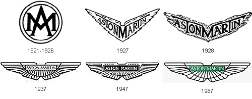 In 1913, Lionel Martin and Robert Bamford founded a company that later would become Aston Martin. At the time, Martin & Bamford Limited produced Singers racing cars, but the duo wanted to create a more sophisticated model of their own. They named their first car Aston Martin after the founder Lionel Martin and the Aston Clinton hill climb racing course where their Singers car had won previously.
We can’t talk about Aston Martin without mentioning James Bond. In 1959, Ian Fleming put his super spy James Bond in an Aston Martin DB Mark III. When it was made into a movie in 1964, Bond drove an updated, supersleek silver Aston Martin DB5 (complete with machine gun, passenger ejector seat, and revolving number plates!)
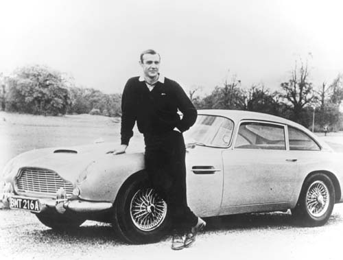
James Bond and his Aston Martin DB5 in Goldfinger
Interestingly, Ian Fleming himself didn’t drive Aston Martin. He preferred the 1963 Studebaker Avanti!
Audi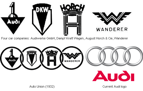 German engineer August Horch, who used to work for Karl Benz, founded his own automobile company A. Horch & Cie in 1899. A decade later, he was forced out of his own company and set up a new company in another town and continued using theHorch brand. His former partners sued him, and August Horch was forced to look for a new name.
When Horch was talking to his business partner Franz Fikentscher at Franz’s apartment, Franz’s son came up with the name Audi:
And so Audiwerke GmbH was born in 1910. In 1932, four car makers Audi, Horch, DKW, and Wanderer merged to form Auto Union. The logo of Auto Union, four interlinked rings that would later become the modern Audi logo, was used only in racing cars – the four factories continued to produce cars under their own names and emblems.
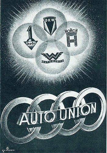
Four car companies became Auto Union (1932)
Fast forward to 1985 (skipping a whole lot of history), when Auto Union ultimately became the Audi we know today.
BMW
In 1913, Karl Friedrich Rapp and Gustav Otto founded two separate aircraft factories that would later merge to form BMW or Bayerische Motoren Werke AG (Bavarian Motor Works). Rapp and Otto actually had little to do with BMW’s manufacturing of cars. Josef Popp, Max Friz and Camillo Castiglioni were the ones who played big roles in making BMW a modern car manufacturer.
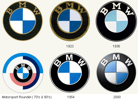
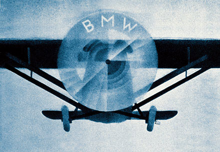
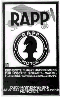 The circular BMW logo was a representation of a spinning propeller of a Bavarian Luftwaffe. At the time, aircrafts were painted with regional colors and the colors of the Bavarian flag were white and blue. It is said that the pilot saw the propeller as alternating segments of white and blue, hence the logo. The roundel was a nod to Karl Rapp’s original company.
During World War I, BMW was a major supplier of airplane engines
(and later airplanes such as the Red Baron)
(thanks Redditors!) to the German government. After the war, Germany was forbidden by the Treaty of Versailles to manufacture airplanes and BMW was forced to change its business: it first made railway brakes before making motorized bicycle, motorcycles and cars.
Update 3/6/08: Neatorama readers Dan S. and Bruce Kennedy who pointed out that the idea of BMW logo being derived from spinning propeller was actually anadvertisement by the company (scroll down about halfway). Also thanks to klaus who pointed us out to the logo of EMW, which BMW took over in 1928.
Buick
The Buick Motor Company was founded in 1903 by David Dunbar Buick, a Scottish-American inventor who invented the overhead valve engine. If you didn’t recognize the name, you’re not alone – but remember this: Buick, a high school drop out founded a company that later became the world’s largest auto company, General Motors.
At 15 years of age, Buick dropped out of school to work for a plumbing fixture manufacturer. When that business failed, Buick and his friend took it over – but within a few years, Buick had an argument with his partner because he preferred to spend his time tinkering with car engines. Buick sold his share in the company and quit.
With the money, Buick founded the Buick Motor Company and within a few years ran it to the ground. He was kicked out of the company by his partner William "Billy" Durant in 1906 and later sold his stock for a mere $100,000. Had he held on to his shares, it would’ve been worth well over $100 million today. In his later years, Buick held low-paying jobs and couldn’t even afford a telephone. He died penniless as an inspector at the Detroit School of Trades. Ironically, years later Durant himself would be forced out. General Motors, the company that Durant built, refused him pension and he died almost penniless. (Source)
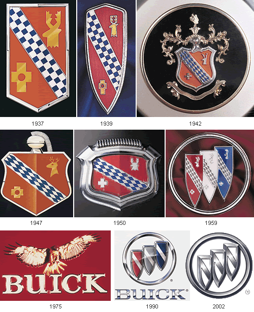
Back to the logo story: Early Buick logos were variations of the cursive word "Buick." In 1930s, General Motor Styling researcher Ralph Pew found a description of the Scottish "Buik" [sic] family crest and decided to use it as a radiator grille decoration. In 1960, the logo incorporated three such shields, to represent the three Buick models then built: LeSabre, Invicta, and Electra.
In 1975, Buick changed their logo to a hawk named "Happy" with the launch of their Skyhawk line. However, in the late 1980s, as the Skyhawk car was retired, Buick went back to the tri-shield logo.
Cadillac
When Henry Ford left his second automobile company, Henry Ford Company (see below), his financial backers tried to liquidate the company’s assets. An engineer named Henry M. Leland persuaded them to continue the company instead. They listened, and so Cadillac was born.
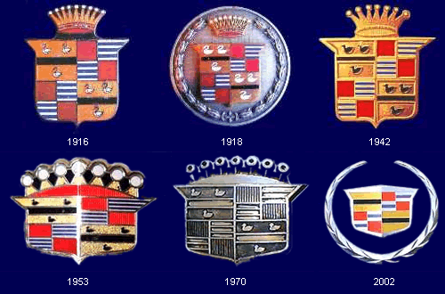
Cadillac’s first logo was based on a family crest of a minor aristocrat that the company was named after: Antoine de La Mothe, Seigneur de Cadillac (Sir of Cadillac). In 1701, de La Mothe founded Fort Pontchartrain which would later become Detroit. Cadillac was named after de La Mothe in 1902, following a bicentenary celebration of the founding of the city.
Problem was, de La Mothe was never a nobility! Born Antoine Laumet, de La Mothe was forced to leave France for America under a mysterious circumstance (some say he committed a crime or was unable to pay his debt). In the New World, he was able to assume a new identity and cobbled together a famiy crest with elements "borrowed" from, shall we say nobler sources.
In 1998, Cadillac had a new design philosophy called "art and science" and had its logo redesigned. Gone were the six birds called the merlettes, the crown, and the entire fabricated de La Mothe family crest as the company tried to shake up its stodgy image. The new logo made its debut a few years later, looking positively like it was made by Piet Mondrian!
Fiat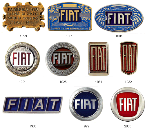
Source: Fiat
Fiat, then named Fabbrica Italiana Automobili Torino (Italian Automobile Factory of Turin), was founded in 1899 by a group of investors, including Giovanni Agnelli who later became its Managing Director. Agnelli bought his shares for $400 (about $10,000 in 2007 money). It’s worth billions now, and there had been an Agnelli in Fiat management ever since. Regardless or perhaps because of its wealth, the Agnelli clan remained a fractious and complicated group of people.
Supposedly, the famous Fiat "scrabble tiles" logo of the 1960s was designed by the company’s Chief Designer who was driving past the Fiat factory during a power outage and saw an outline of the factory’s neon sign against the dark sky (Source: The Language of Auto Emblems)
Ford
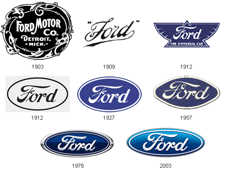
Most people know that Ford was founded by (who else?) Henry Ford. What most people didn’t know was that this was his third automobile company. Ford experimented with cars while working for Thomas Edison, and left to found his first auto company, The Detroit Automobile Company, which went bankrupt in just 2 years. He then built a race car and founded Henry Ford Company. Ford left that one after just one year (the company later became Cadillac – see above).
In 1902, Ford went on to create his third automobile company, the Ford & Malcomson, Ltd., and almost lost that one when sales were slow. He was unable to pay his bills to John and Horace Dodge, who supplied parts. Ford’s partner brought in a group of investors and even convinced the Dodge Brothers to accept shares in the company, which was renamed Ford Motor Company. Later, the Dodge Brothers went on to form their own car company (can you guess what?)
In 1909, Childe Harold Wills, Ford’s first chief engineer and designer (who also help to design the Model T), lend a script font that he created to make his own business card, to create the Ford logo. The famous blue oval was added later for the 1927 Model A – it remained in use until today.
Mazda
Mazda began its life in 1920 as the Toyo Cork Kogyo Co. in Hiroshima, Japan. At the time, there was a cork shortage because of World War I, so the company was founded to process a cork substitute made from the bark of an Abemaki or Chinese cork oak tree. It was a good idea at the time, but shortly afterwards Japan could get real cork again and the company foundered.
In 1927, Jujiro Matsuda came onboard and the company began manufacturing tools, three-wheeled "trucks" and then cars. After World War II, the company formally adopted the name Mazda, which depending on who you ask, stood for the Zoroastrian god Ahura Mazda or an anglicized pronunciation of Matsuda the founder’s name (or both).
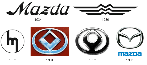
In the 1936 logo, the M shaped curve was inspired by the emblem of Hiroshima city. The 1991 and 1992 logos symbolized a wing, the Sun and a circle of light. Mazda’s current logo, nicknamed the "owl" logo, was designed by Rei Yoshimara in 1997. The stylized "M" was meant to look like stretched wings, but many people saw a stylized tulip instead.
Mercedes-Benz
The modern Mercedes-Benz traced its lineage to a 1926 merger of two car companies,Daimler-Motored-Gesellschaft or DMG, founded by Gottlieb Daimler (along with Wilhelm Maybach), and Benz & Cie, founded by Karl Benz. Both Daimler and Benz worked independently to invent internal combustion-powered automobiles. Their factories were actually just 60 miles apart, yet they didn’t know of each other’s early work.
After World War I, the German economy was in tatters, and to survive, the two companies formed a syndicate in 1924, where they would continue to sell their separate brands but would standardize design, share purchasing and advertising. In 1926, however, the two companies merged into Daimler-Benz.
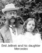 The name "Mercedes" came about in 1900. A wealthy European businessman and racing enthusiast named Emil Jellinek began selling Daimler’s cars. He wanted a faster car, and specified a new engine to be designed by Maybach and to be named after his 10-year-old daughter’s nickname, Mercédès or Spanish for
 "grace."
"Mercy" (See below)
Jellinek was quite a character. He used to pepper DMG’s engineers with colorful suggestions and criticism such as "Your manure wagon has just broken down on schedule" and "You are all donkeys". However, as he actually sold a lot of cars, he was tolerated and even listened to. Later, Jellinek would add Mercedes to his own and became Emil Jellinek-Mercedes. (Source: My Father Mr. Mercedes by Guy Jellinek-Mercedes and MBUSA Biographies)
The star in Daimler’s logo came from an old postcard where Gottlieb Daimler had drawn a star above the picture of his house and wrote that "this star would one day shine over [his] own factory to symbolize prosperity." The three-pointed star symbolized Daimler’s ambition of making vehicles "on land, on water and in the air." (Source: Daimler)
After the merger, a new logo was designed. It combined the symbols of the two companies: the three-pointed star of DMG and the laurel wreath of Benz.
Update 2/18/08: There’s a dispute on the origin of the name “Mercedes.” According toBaby Names World, Mercedes is a girl’s name of Spanish origin meaning “Mercy.” It was taken from the Virgin Mary’s liturgical title “Maria de las Mercedes” (Mary of the Mercies; ‘Our Lady of Ransom’):
Latin ‘mercedes’ originally meant ‘wages’ or ‘ransom’.
In Christian theology, Christ’s sacrifice is regarded as a ‘ransom for the sins of mankind’, hence an ‘act of ransom’ was seen as identical with an ‘act of mercy’.
Mitsubishi
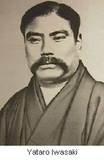 In 1854 feudal Japan, a man named Yataro Iwasaki, son of a provincial farmer whose grandfather sold the family’s samurai status to settle some debt, began his career on the wrong foot: he was called home from school at the age of 19 when his father was injured in a dispute with the village leader. Iwasaki asked a local magistrate to hear his case, and when refused, accused the man of corruption. Iwasaki was promptly jailed for seven months.
Fast forward to 1868: Iwasaki was working for the Tosa clan when the Meiji Restoration abolished Japan’s feudal clan system. He acquired Tsukumo Shokai, the Tosa clan’s shipping business and renamed it Mitsubishi in 1873.
It was a fourth-generation Iwasaki, a man named Kayota Iwasaki, who turned Mitsubishi into a giant corporate group that included an automobile manufacturing company, Mitsubishi Motors.
The name Mitsubishi was a combination of the words "mitsu" (three) and "hishi" (water chestnut, used in Japan to mean a rhombus or a diamond shape). The official translation of the name was "three diamonds."
The Mitsubishi logo was a combination of the Iwasaki family crest, three stacked diamonds, and the three-leaf crest of the Tosa Clan.
Peugeot
Peugeot got its start in 1812 in Montbeliard, France, when two brothers, Jean-Pierre and Jean-Frédéric Peugeot converted their windmill into a steel mill. Their first products were rolled steel for saw blades and clock springs, as well as cylindrical steel rods. For decades, the Peugeot family business made metal goods, machine tools, crinoline dresses, umbrellas, wire wheels, irons, sewing machines, kitchen gadgets and by 1885, bicycles.
Indeed, Peugeot’s entry into the automobile business was by way of bicycles. At the time, the company was one of the largest bicycle manufacturers in France. In 1889, Armand Peugeot created the company’s first steam-powered car. A year later, he abandoned steam in favor of gas-powered internal combustion engine after meeting Gottlieb Daimler.
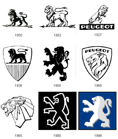
The Peugeot "lion" logo was designed by jeweler and engraver Justin Blazer in 1847. It was based on the flag of the Région Franche-Comté. The logo was stamped on Peugeot kitchen gadgets to denote the quality of their steel. It took Armand 14 years to convince his family that cars could be a moneymaker. Only then did they allow him to use the Peugeot lion logo. (Source: Independent)
Now, you may not drive a Peugeot car, but I bet you’ve used a Peugeot invention of 1842: the peppermill. The mill’smechanism was so reliable that it remained virtually unchanged until today.
Renault
Louis Renault was 21 when he made his first car in the backyard of his parent’s home. He soon got orders for cars, so in 1898, along with his brothers and friends, Louis opened the company Société Renault Frères in Boulogne-Billancourt, France.
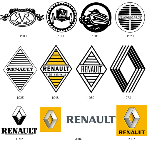
The first Renault logo, drawn in 1900 featured the three initials of the Renault brothers: Louis, Ferdinand and Marcel. In 1906, the logo changed to a front end of a car enclosed in a gear wheel.
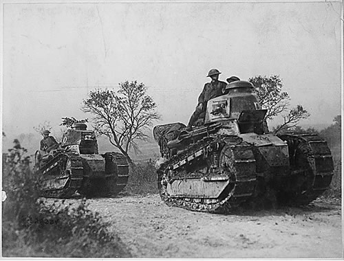
Renault FT-17 tank, driven by American troops, going forward to the battle line in the Forest of Argonne. (Source: The National Archives)
During World War I, Renault manufactured light tanks for the Allies called the Renault FT-17. This was so popular that after the war, Renault actually changed its logo into a tank. The diamond shape was introduced in 1925 and remained until today. The modern Renault logo was created in 1972 by Victor Vasarely
Saab
If you’ve ever seen a Saab car commercial, then you’d know that the company was "born from jets". You wouldn’t know it from the car’s staid style, but historically this was accurate: In 1937, an aircraft company called Svenska Aeroplan Aktiebolaget("Swedish Aeroplane Limited" or simply SAAB) was created to meet the needs of the Swedish Air Force.
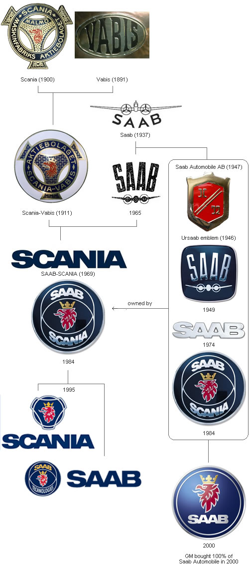
When World War II ended, SAAB the airplane company started making cars to diversify its business. The first car it made was a prototype called the the Saab 92001 or ursaab (meaning "original Saab") in 1946. It was test-driven for nearly 330,000 miles (530,000 km) in utter secrecy, usually on narrow and muddy forest roads in the early mornings or late nights.
In 1947, the Saab Automobile company was incorporated. The company’s first car was the Saab 92, named because it was simply the company’s 92nd design project (the previous 91 had all been aircraft).
The griffen logo, featuring the head of a mythological beast that had a body of a lion and head and wings of an eagle, came from Vadis-Scania, a truck manufacturer that merged with SAAB (airplane) company. The griffen was a coat of arms of the province Scania.
In 2000, Saab Automobile company was bought out by General Motors, and thus no longer had any connection with SAAB outside of its history and logo similarities.
CAR FOUNDER WITH YEAR
Alfa Romeo
Originally designed by Romano Cattaneo and Giuseppe Merosi, in 1910 The Alfa Romeo company was founded in 1910, and the logo has changed many times since then, but its main items have remained – the red on white cross of Milan, and the serpent from the Visconti family coat of arms. I’m not a big fan of the Alfa Romeo logo. Mainly because I think there’s too much detail in the serpent, which becomes lost at small sizes.
Originally designed by Romano Cattaneo and Giuseppe Merosi, in 1910
 The Alfa Romeo company was founded in 1910, and the logo has changed many times since then, but its main items have remained – the red on white cross of Milan, and the serpent from the Visconti family coat of arms. I’m not a big fan of the Alfa Romeo logo. Mainly because I think there’s too much detail in the serpent, which becomes lost at small sizes.
Audi
Designed in 1932 Audi’s four ring logo was designed to symbolize the merger of four individual car companies. It’s certainly one of my favourite car manufacturer logos.
Designed in 1932
 Audi’s four ring logo was designed to symbolize the merger of four individual car companies. It’s certainly one of my favourite car manufacturer logos.
BMW
Designed in 1917 The blue and white panels of the Bavarian flag were placed at the centre of the design. During the late 1920s, the BMW logo was given a new interpretation, that of a rotating propellor. Simple and iconic.
Designed in 1917
 The blue and white panels of the Bavarian flag were placed at the centre of the design. During the late 1920s, the BMW logo was given a new interpretation, that of a rotating propellor. Simple and iconic.
Fiat
Designed by Robilant Associati and the Fiat Style Centre, in 2006 Between 1931 and 1968, a shield emblem decorated Fiats. This logo design recalls the older icon, and the revised version has been made 3D. There’s something about the type that just doesn’t inspire a good feeling. Is that just me?
Designed by Robilant Associati and the Fiat Style Centre, in 2006
 Between 1931 and 1968, a shield emblem decorated Fiats. This logo design recalls the older icon, and the revised version has been made 3D. There’s something about the type that just doesn’t inspire a good feeling. Is that just me?
Ford
Designed by CH Wills, in 1909 The designer, CH Wills, was actually an engineer and draughtsman, working for Henry Ford in the early days. Extremely recognisable through the sheer scale of Ford production. The logo has certainly stood the test of time, but I’m curious as to what other logo designers think of it. Maybe it’s just that I’m not so keen on ovals.
Designed by CH Wills, in 1909
 The designer, CH Wills, was actually an engineer and draughtsman, working for Henry Ford in the early days. Extremely recognisable through the sheer scale of Ford production. The logo has certainly stood the test of time, but I’m curious as to what other logo designers think of it. Maybe it’s just that I’m not so keen on ovals.
Jaguar
Designed by The Partners, in 2002 In updating the older Jaguar logo, The Partners altered the logotype and digitally remodelled the leaping Jaguar. I’ve often wondered why the Jaguar is shown leaping from right to left, countering how the eye reads the text from left to right. Perhaps it’s to create a more streamlined end?
Designed by The Partners, in 2002
 In updating the older Jaguar logo, The Partners altered the logotype and digitally remodelled the leaping Jaguar. I’ve often wondered why the Jaguar is shown leaping from right to left, countering how the eye reads the text from left to right. Perhaps it’s to create a more streamlined end?
Lexus
Designed by Siegel & Gale, in 2002 The name ‘Lexus’ has been attributed to the words ‘luxury’ and ‘elegance’, and this is one that I quite like.
Designed by Siegel & Gale, in 2002
 The name ‘Lexus’ has been attributed to the words ‘luxury’ and ‘elegance’, and this is one that I quite like.
Mercedes-Benz
Designed in 1909 One of the most recognisable logos around. A three-pointed star had been designed by Gottlieb Daimler, to show the ability of his motors for land, air, and sea use. This star first appeared on a DMG model in 1909, so it was chosen for the new logo. The traditional laurel wreath symbol used by Karl Benz was added along with his name to complete the new logo. The logo with a plain ring, as seen today, was not used until 1937.
Designed in 1909
 One of the most recognisable logos around. A three-pointed star had been designed by Gottlieb Daimler, to show the ability of his motors for land, air, and sea use. This star first appeared on a DMG model in 1909, so it was chosen for the new logo. The traditional laurel wreath symbol used by Karl Benz was added along with his name to complete the new logo. The logo with a plain ring, as seen today, was not used until 1937.
Mitsubishi
Designed by Yataro Iwasaki, in 1870 I featured the Mitsubishi logo in an earlier post, 15 wonderfully simple logo designs, and it’s a design I greatly admire. ‘Mitsubishi’ is a combination of the words ‘mitsu’ and ‘hishi’. ‘Mitsu’ means three, and ‘hishi’ means water chestnut. Japanese have used the word ‘hishi’ for a long time to denote a rhombus or diamond shape. In speech, Japanese often bend the ‘h’ to sound like a ‘b’ when it occurs in the middle of a word. So they pronounce the combination of ‘mitsu’ and ‘hishi’ as ‘mitsubishi’.
Designed by Yataro Iwasaki, in 1870
 I featured the Mitsubishi logo in an earlier post, 15 wonderfully simple logo designs, and it’s a design I greatly admire. ‘Mitsubishi’ is a combination of the words ‘mitsu’ and ‘hishi’. ‘Mitsu’ means three, and ‘hishi’ means water chestnut. Japanese have used the word ‘hishi’ for a long time to denote a rhombus or diamond shape. In speech, Japanese often bend the ‘h’ to sound like a ‘b’ when it occurs in the middle of a word. So they pronounce the combination of ‘mitsu’ and ‘hishi’ as ‘mitsubishi’.
Nissan
Designed by FutureBrand, in 2000 This metallic roundel is part of a successful Nissan revival, and in my opinion, is an improvement on those older designs that can be viewed by scrolling down on this page:Cartype Nissan Logo.
Designed by FutureBrand, in 2000
 This metallic roundel is part of a successful Nissan revival, and in my opinion, is an improvement on those older designs that can be viewed by scrolling down on this page:Cartype Nissan Logo.
Renault
Designed by Éric de Berranger, in 2004 Interesting typeface info: both the Renault logo and its documentation (technical as well as commercial) had used a specially designed typeface called Renault, developed by British firm Wolff Olins. This type family is said to have been designed not for prestige reasons, but mainly to save costs at a time where the use of typefaces was more costly than it is now. In 2004, French typeface designer Jean-François Porchez was commissioned to design a replacement. This was shown in October of that year and is called Renault Identité. I have featured Wolff Olins on my other blog: London 2012 olympic logo disaster.
Designed by Éric de Berranger, in 2004
 Interesting typeface info: both the Renault logo and its documentation (technical as well as commercial) had used a specially designed typeface called Renault, developed by British firm Wolff Olins. This type family is said to have been designed not for prestige reasons, but mainly to save costs at a time where the use of typefaces was more costly than it is now. In 2004, French typeface designer Jean-François Porchez was commissioned to design a replacement. This was shown in October of that year and is called Renault Identité. I have featured Wolff Olins on my other blog: London 2012 olympic logo disaster.
Seat
Designed by Enterprise IG, in 1950 The striped ‘S’ came about from the first letter of the previous logotype.
Designed by Enterprise IG, in 1950
 The striped ‘S’ came about from the first letter of the previous logotype.
Volkswagon
Designed by Franz Xaver Reimspiess, in 1938 No official designer has been recorded for this logo. The latest variation of the VW logo include a 3D highlight from MetaDesign, added in 2000. A lot of car firms are implementing a 3D appearance nowadays. For how long do you think this trend will last?
If you can add to the explanations for any of the above logos, please do. I can’t ensure that I’m 100% correct, and will gladly modify possible errors. Do you have a favourite car manufacturer logo? There are many more that aren’t listed, and I’ll feature them in upcoming blog posts.
Designed by Franz Xaver Reimspiess, in 1938
 No official designer has been recorded for this logo. The latest variation of the VW logo include a 3D highlight from MetaDesign, added in 2000. A lot of car firms are implementing a 3D appearance nowadays. For how long do you think this trend will last?
If you can add to the explanations for any of the above logos, please do. I can’t ensure that I’m 100% correct, and will gladly modify possible errors. Do you have a favourite car manufacturer logo? There are many more that aren’t listed, and I’ll feature them in upcoming blog posts.
Subscribe to:
Posts (Atom)

